Getting set up with Storyblok and SvelteKit
I’ve been having a play around with Storyblok this evening and want to make some notes on getting set up with it.
With the moving target that is the public beta of SvelteKit there’s a few things that have changed recently which I want to document here.
If you’ve not used Svelte or SvelteKit before you can check out the awesome tutorial for Svelte over on svelte.dev/tutorial it’s got everything you need. There’s also learn.svelte.dev for SvelteKit which is under development at the time of writing.
If you want to follow along, minimum requirements will be a computer development setup with Node version 16+ installed and a text editor, I’ll be using VS Code.
Setup the SvelteKit project
I’ll get the SvelteKit project set up first with a few commands:
npm init svelte storyblok-and-sveltekit
cd storyblok-and-sveltekit
I’ll be using pnpm for installing dependencies, if you prefer npm or yarn you can use those instead. Just be aware if you’re copy
pasting terminal commands you’ll need to change that.
I’ll be picking the following options from the SvelteKit CLI:
? Which Svelte app template? › - Use arrow-keys. Return to submit.
    SvelteKit demo app
❯   Skeleton project - Barebones scaffolding for your new SvelteKit app
? Add type checking with TypeScript? › - Use arrow-keys. Return to submit.
    Yes, using JavaScript with JSDoc comments
❯   Yes, using TypeScript syntax
    No
✔ Add ESLint for code linting? … Yes
✔ Add Prettier for code formatting? … Yes
✔ Add Playwright for browser testing? … Yes
These are the options I usually always pick when creating any new
SvelteKit project. What I’ve picked will not impact the rest of this
guide, especially ESLint, Prettier and Playwright.
If you decide you want to go without TypeScript support then remove
the lang="ts" from the <script> tag in the coming examples.
If you decide to go with JavaScript with JSDoc comments then you’ll still need to annotate for types.
I’ll install dependencies then run the development server:
pnpm i
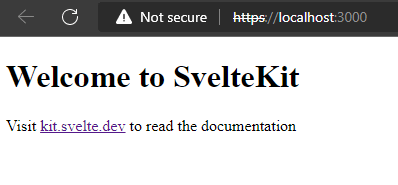
pnpm run devGoing to http://localhost:5173 will display the SvelteKit skeleton
project.
Setup Tailwind
Just before I go onto the Storyblok configuration, I’ll want to get some nice default styles into the project with Tailwind CSS. This is a one liner setup with the awesome Svelte Add project:
## --typography adds the Tailwind typography plugin
npx svelte-add@latest tailwindcss --typography
The script will configure Tailwind for use in the project and add in
the typography plugin to the tailwind.config.cjs file.
All that’s needed to do after that is install the dependencies with pnpm i.
Get Storyblok setup
If you’re following along and you’ve not got a Storyblok account already then you’ll need to sign up for one, otherwise sign in.
From here, I’m greeted with a welcome screen and a button to ‘Create a new space’.
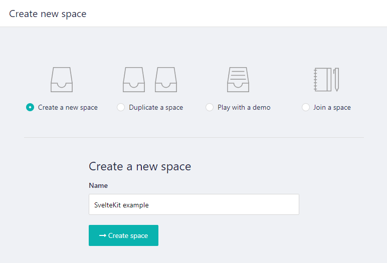
Clicking that I’ll be taken to the ‘Create a new space’ page with several options, the default ‘Create new space’ is good enough for this guide. I’ll give it a name (I’m calling mine ‘SvelteKit example’ very imaginative, I know 😊) then I’ll click the ‘Create space’ button.
I’m then taken to the ‘Content’ section (in the left hand sidebar), from here there’s a list of content, as it was a new space (start from scratch) there’s only a home page content type shown in the main screen.
You’ll also notice in the sidebar toward the bottom there’s a ‘Switch to V2’ button.

I’ll be using the V2 version so clicking on that will change the screen and take me to the ‘Dashboard’ in the sidebar, I can then select ‘Content’ from the sidebar. On the main page I’ll select the ‘Home’ page content type.
That takes me to the visual editor displaying ✨ Welcome to the Visual Editor ✨ from this welcome section I can copy the ‘Access token’ needed for accessing the Storyblok API.
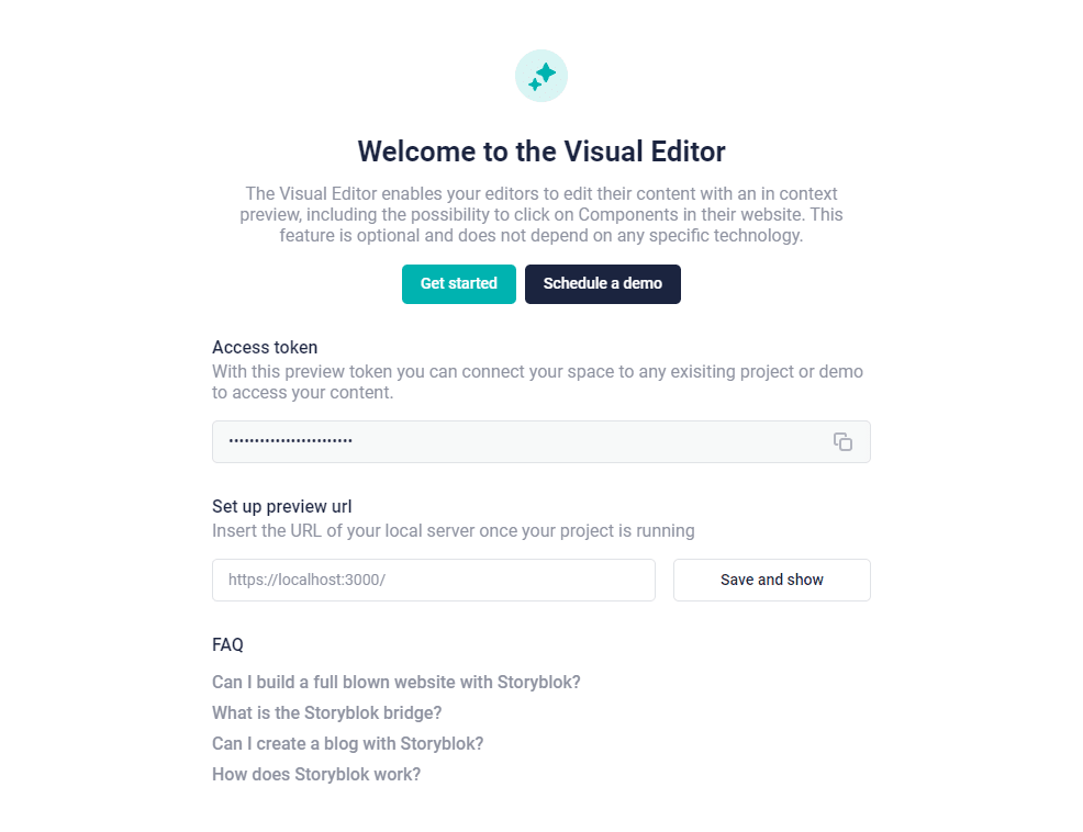
There’s also a ‘Set up preview url’ section with an input field for the URL of my local dev server.
I’ll add in the suggested URL from the placeholder in the input field:
https://localhost:3000/Yes! That is https!
Before clicking ‘Save and show’ I’ll need to get my SvelteKit project set up to enable the visual editor.
SvelteKit and Vite HTTPS server setup
Storyblok needs to run from a HTTPS server, so unlike normal local
development (on HTTP) I’ll need to create a local HTTPS server. To
do that I’ll install the @vitejs/plugin-basic-ssl Vite plugin and
configure it. First up install the Vite plugin:
pnpm i -D @vitejs/plugin-basic-sslThis is also a good time to set the server port as Vite will use the default port (5173) otherwise.
In the vite.config.js file I’ll add the following:
import { sveltekit } from '@sveltejs/kit/vite'
import basicSsl from '@vitejs/plugin-basic-ssl'

/** @type {import('vite').UserConfig} */
const config = {
	plugins: [sveltekit(), basicSsl()],
	server: {
		port: 3000,
		https: true,
	},
}

export default config
I can start the dev server now (pnpm run dev) and the terminal
output will show the HTTPS server running.
Going to https://localhost:3000/ on Edge I get a warning.
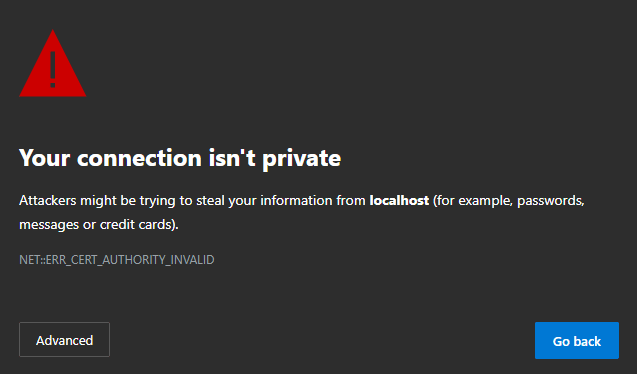
From here I can click on the ‘Advanced’ button and select the ‘Continue to localhost (unsafe)’ link.
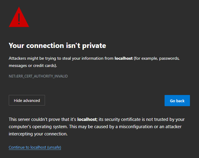
Now I have access to https://localhost:3000/ with a persistent
warning from Edge to show that I’m using a connection without a
certificate (https
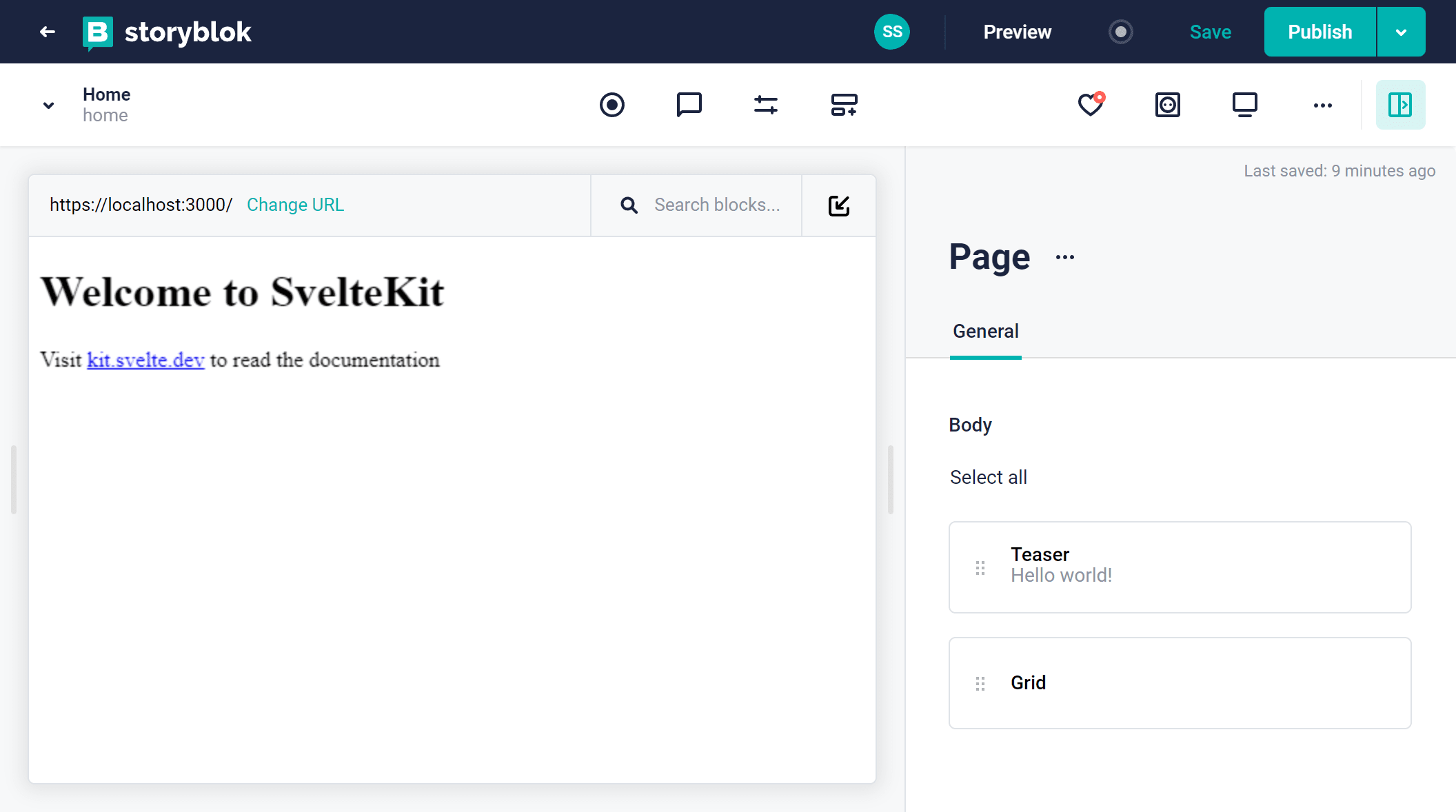
Over to the visual editor page on Storyblok I can click on the ‘Save and show’ button now.
The live preview will update showing a 404 page on here I need to
click on the sliders for ‘Entry configuration’ in the header and set
the ‘Real path’ as /.

Clicking ‘Save & Close’ will now show the SvelteKit skeleton project!
Now I can configure Storyblok to work with my local dev server and my Storyblok project to show the page content type with it’s nested types on there.
Storyblok bridge with Svelte
If you’ve not used Storyblok before, this is where the magic happens.
The Svelte Storyblok SDK (amongst other things) allows the live
preview and editing of the components in Storyblok to be reflected on
the project running on localhost.
Install the @storyblok/svelte package and the Storyblok peer
dependency for axios, at the time of writing this was how I resolved
this. There’s a mention of adding axios to optimiseDeps in the Add a Headless CMS to Svelte in 5 minutes guide but adding that to
the vite.config.js file caused the same errors.
pnpm i -D @storyblok/svelte axiosCreate SvelteKit files for use with Storyblok
I’ll create the files I’m going to need to get the connection between the local SvelteKit project and the Storyblok project set up.
Svelte Add already took care of creating the SvelteKit __layout.svelte file for me, so I’ll create some components to
represent the various content types in Storyblok. I’ll need to create
the following files:
- Content type: page
- Nested (Block): grid, feature, teaser
I’ll use the terminal to create the files and folders (directories) needed:
# create lib and components folders in src
mkdir -p src/lib/components
# Create the component files needed
touch src/lib/components/{feature.svelte,grid.svelte,page.svelte,teaser.svelte}
Environment variables
As I’ll want to be committing this to source control I don’t really want to add my access tokens. I can use the Vite way which is to add:
import.meta.env.VITE_VARIABLE_NAMETo the Svelte file and add the tokens to a .env file to access them,
however, Vite will expose these on the client (the browser).
To keep them away from prying eyes I can use env-cmd which will
allow me to access the environment variables without Vite.
I’ll install the env-cmd package for use shortly:
pnpm i -D env-cmdI did a post a while back on SvelteKit .env secrets if you want to give that a read!
I’ll create a .env file in the root of the project and a env-vars.ts file in the src/lib folder.
touch .env
touch src/lib/env-vars.ts
In the .env file I can define however many environment variables I
need for use locally. I’ve put an example for one for using draft and
published tokens where the stage is published which is commented out:
# draft
STORYBLOK_ACCESS_TOKEN=my-local-access-token
STORYBLOK_STAGE=draft
# published
# STORYBLOK_ACCESS_TOKEN=my-production-access-token
# STORYBLOK_STAGE=published
I can create additional tokens in the ‘Settings’ > ‘Access tokens’ section on Storyblok.

Within the env-vars.ts file I can export the variables needed for
the access token (STORYBLOK_ACCESS_TOKEN) and the stage
(STORYBLOK_STAGE):
export const STORYBLOK_ACCESS_TOKEN = process.env['STORYBLOK_ACCESS_TOKEN']
export const STORYBLOK_STAGE = process.env['STORYBLOK_STAGE']
I will now be able to import these in the currently empty SvelteKit files.
Last thing to do here is to add env-cmd to the package.json scripts so it runs on the dev script:
"scripts": {
  "dev": "env-cmd vite dev",
  // rest of the scripts
If I wanted to create builds locally I’d also need to create a build:local script which uses env-cmd too:
"scripts": {
  "dev": "env-cmd vite dev",
  "build": "vite build",
  "build:local": "env-cmd vite build",
  "preview": "vite preview",
  // rest of the scripts
SvelteKit layout file
A layout file in SvelteKit is a way to persist elements across route changes, like a navbar and footer. This is also the place to initialise Storyblok for use across the project.
To load data before the page loads I’ll use the <script context="module"> script tags to initialise the Storyblok
client.
I’ll add in the access token for the Storyblok project here and import
the components needed for use in the storyblokInit function from the lib folder.
<script context="module">
	import Feature from '$lib/components/feature.svelte'
	import Grid from '$lib/components/grid.svelte'
	import Page from '$lib/components/page.svelte'
	import Teaser from '$lib/components/teaser.svelte'
	import { STORYBLOK_ACCESS_TOKEN } from '$lib/env-vars'
	import { apiPlugin, storyblokInit } from '@storyblok/svelte'
	import '../app.css'

	storyblokInit({
		accessToken: STORYBLOK_ACCESS_TOKEN,
		use: [apiPlugin],
		components: {
			feature: Feature,
			grid: Grid,
			page: Page,
			teaser: Teaser,
		},
	})
</script>

<main class="prose prose-xl">
	<slot />
</main>
Component files
Now I can get to adding code to the component files. Credit to Josefine Schaefer and her example code on GitHub.
The page component (page.svelte) is a root block content type and
uses a Svelte action in storyblokEditable to use the prop being
passed to it (export let blok).
Using a Svelte each expression I can loop through the blok.body and
pass the blok to the StoryblokComponent as props.
I’m using the TypeScript any type because I was having issues using
the StoryData type.
<script lang="ts">
	import {
		StoryblokComponent,
		storyblokEditable,
	} from '@storyblok/svelte'

	export let blok: any
</script>

<div use:storyblokEditable={blok} class="px-6">
	{#each blok.body as blok}
		<StoryblokComponent {blok} />
	{/each}
</div>
For the grid.svelte component, a similar story to the page component
except I’m checking for a columns property and looping over that.
<script lang="ts">
	import {
		StoryblokComponent,
		storyblokEditable,
	} from '@storyblok/svelte'

	export let blok: any
</script>

<div use:storyblokEditable={blok} class="mb-6 flex py-8">
	{#each blok.columns as blok}
		<div class="flex-auto px-6">
			<StoryblokComponent {blok} />
		</div>
	{/each}
</div>
The feature.svelte file is nested in the grid component!
Let me break down my understanding of it, the blok prop being passed
to the StoryblokComponent in grid.svelte is the prop being passed
into this file (feature.svelte).
If I dump out the data being passed into the grid component, I get this:
columns: [
	{
		_uid: 'eb32fb87-721d-4834-8523-73ea81cbb6f7',
		name: 'Feature 1',
		component: 'feature',
		_editable: '<!--#storyblok#{"name": "feature"} -->',
	},
]
Then the data being passed to the feature component looks like this:
{
  _uid: 'eb32fb87-721d-4834-8523-73ea81cbb6f7',
  name: 'Feature 1',
  component: 'feature',
  _editable: '<!--#storyblok#{"name": "feature"} -->',
}
It’s the same data, with the individual columns being rendered out
by feature.svelte as a child (or nested) component.
I’ll use the storyblokEditable action in the feature.svelte component passing in the blok prop and render out a div with the blok.name for the content.
<script lang="ts">
	import { storyblokEditable } from '@storyblok/svelte'

	export let blok: any
</script>

<div use:storyblokEditable={blok} class="py-2">
	<div class="text-lg">{blok.name}</div>
</div>
For teaser.svelte I’m going to use the same pattern as feature.svelte, but as I want to use it as the page heading, I’ll
wrap the blok.name in a h1 tag.
<script lang="ts">
	import { storyblokEditable } from '@storyblok/svelte'

	export let blok: any
</script>

<div use:storyblokEditable={blok}>
	{blok.headline}
</div>
Svelte index (home) page
I’ve got all the components I need now for use in storyblokInit.
In the index page I’ll want to get the Storyblok home data for use
in the page. Much like with the layout file I’ll want to get this data
before the page loads so I’ll need a <script context="module"> block
to call the results from the useStoryblokApi in a SvelteKit load
function.
I’ll destructure the story out of the response from the API call and
return that as props for the page to use.
With Svelte onMount, this is called once the page has loaded, this
is when the useStoryblokBridge is called passing in the story prop
from the context module.
Add additional field to Feature block
Let’s say now, if I wanted to add a bit more content to the feature component, like some body content explaining the feature. I’ll expand on that a little now.
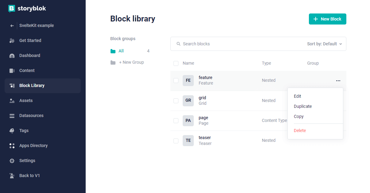
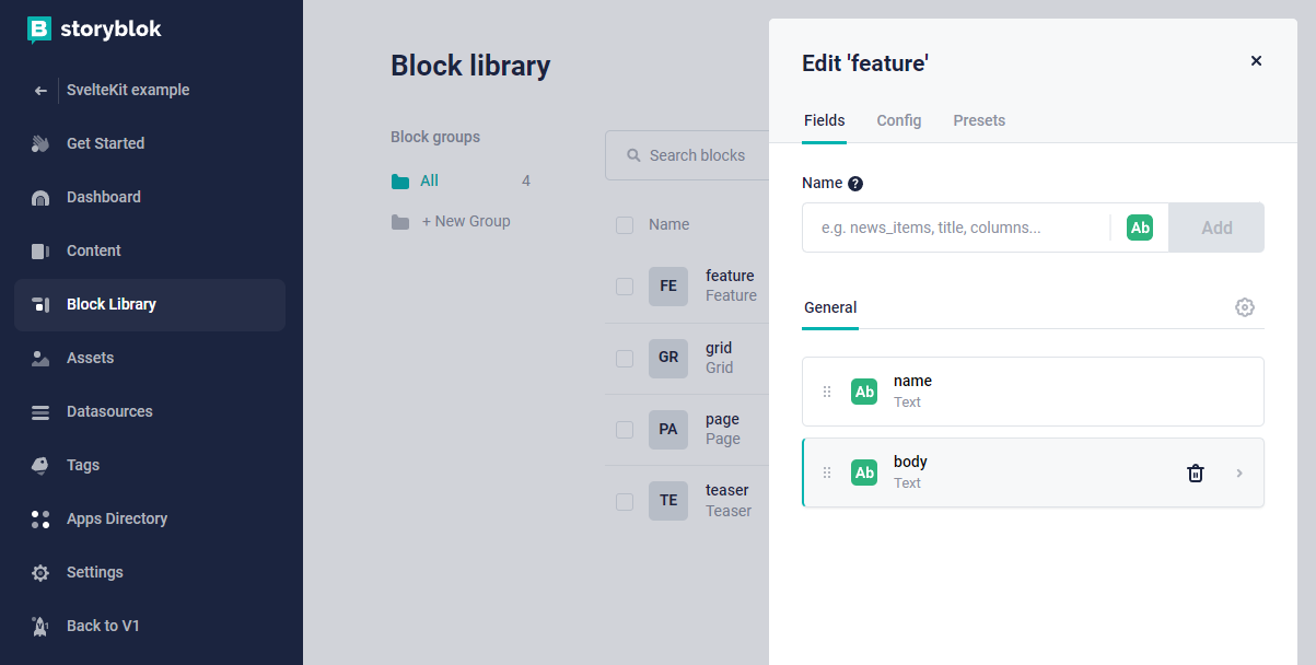
What I’ll do to finish up here is add a new field to the feature block, I can get to my block library from navigating back from the visual editor page and select the ‘Block Library’ from the sidebar.
I can hover over the ‘feature’ block and click the ellipsis (...)
and select ‘Edit’.
This brings up a context menu where I can edit the feature block and add additional fields to it, I’m going to give the field a name of body and click the ‘Add’ button.
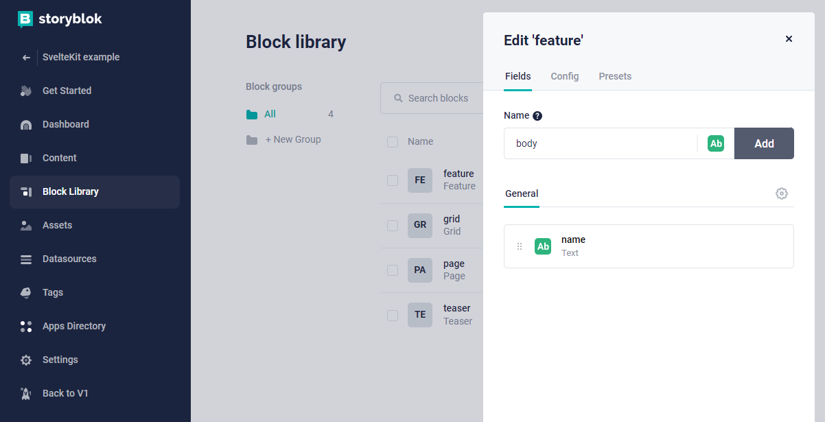
The newly created field will now show up in the list under the ‘name’ field.
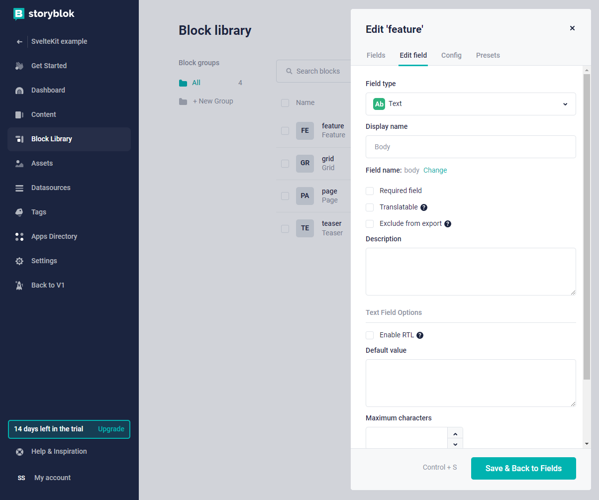
Clicking on that will take me to the edit field options where I can
select the field type. I’m going to keep it as a text field, I could
go into using the Storyblok RichTextResolver but I think I’ll
leave that for another post.
Now, if I go back to the ‘Content’ section in the sidebar and select the ‘Home’ story, I can select the ‘Grid’ then ‘Feature’ I can see there’s a new ‘Body’ field I can start adding content to.
I’ll add in content to the three fields and save the content for each block as I go along.
To display the feature body content I’ll make a little adjustment to
the feature.svelte file to include the blok.body content.
<script lang="ts">
	import { storyblokEditable } from '@storyblok/svelte'

	export let blok: any
</script>

<div use:storyblokEditable={blok} class="py-2">
	<div class="text-lg">{blok.name}</div>
	<div class="text-lg">{blok.body}</div>
</div>
Conclusion
There you have it! I’ve gone from scratch to a basic SvelteKit project to consume a Storyblok API.
I hope you found it useful and that you have everything you need to get started with Storyblok and SvelteKit.
I’ve only really scratched the surface of Storyblok here using the default story generated when creating a new space, but I’ve learned a lot in the process documenting this.
Resources
From searching around I found all these resources which helped me along the way:
https://www.storyblok.com/tp/add-a-headless-cms-to-svelte-in-5-minutes https://github.com/josefineschaefer/Storyblok-SvelteKit https://github.com/storyblok/storyblok-svelte https://www.storyblok.com/docs/Guides/nestable-blocks https://www.storyblok.com/docs/Guides/root-blocks
There's a reactions leaderboard you can check out too.
Sign up for the newsletter
Want to keep up to date with what I'm working on?
Join other developers and sign up for the newsletter.
I care about the protection of your data. Read the Privacy Policy for more info.